wa·ter·shed
/ˈwôdərˌSHed,ˈwädərˌSHed/
noun
- 1.an area or ridge of land that separates waters flowing to different rivers, basins, or seas.
synonyms: divide "the Mackenzie River watershed" - 2.an event or period marking a turning point in a course of action or state of affairs."these works mark a watershed in the history of music"
synonyms: turning point, milestone, landmark "a watershed in the party's history"
First, what is a portfolio exchange? An exchange is usually organized by an individual or group (i.e. SGCI or MAPC conferences). The artist has to address the theme of the portfolio, such as: dreamland, flux, sphere, watershed, communities west, navigating currents, etc... the theme can be about whatever the organizer wants the artists to think about and make artwork about. Each artist will be invited into the exchange and be expected to make a certain edition of prints. In the case of "Watershed" the forty participating printmakers were required to make 42 prints and will then receive 40 different prints back (well I guess 39 since I do receive one of my own back). The other two prints or sets of prints will be housed permanently in the Boise State University's special collections and exhibited at the Katherine Albertson Library at Boise State University in April 2016.
Exchange portfolios are a great way to build your exhibition resume and grow your art collection. Plus you get to see what other contemporary printmakers are doing and create relationships with them.
The requirements for Watershed were this:
- -Hand process printmaking media only (intaglio, relief, monotype, lithography, collagraph and/or photographic variations of these processes are welcome). Please no ink jet prints or photography.
- Paper size: 11” x 14” (horizontal or vertical orientation)
- Edition Size: 42
- Interleaving: Glassine wrapped around each print (like a taco shell)
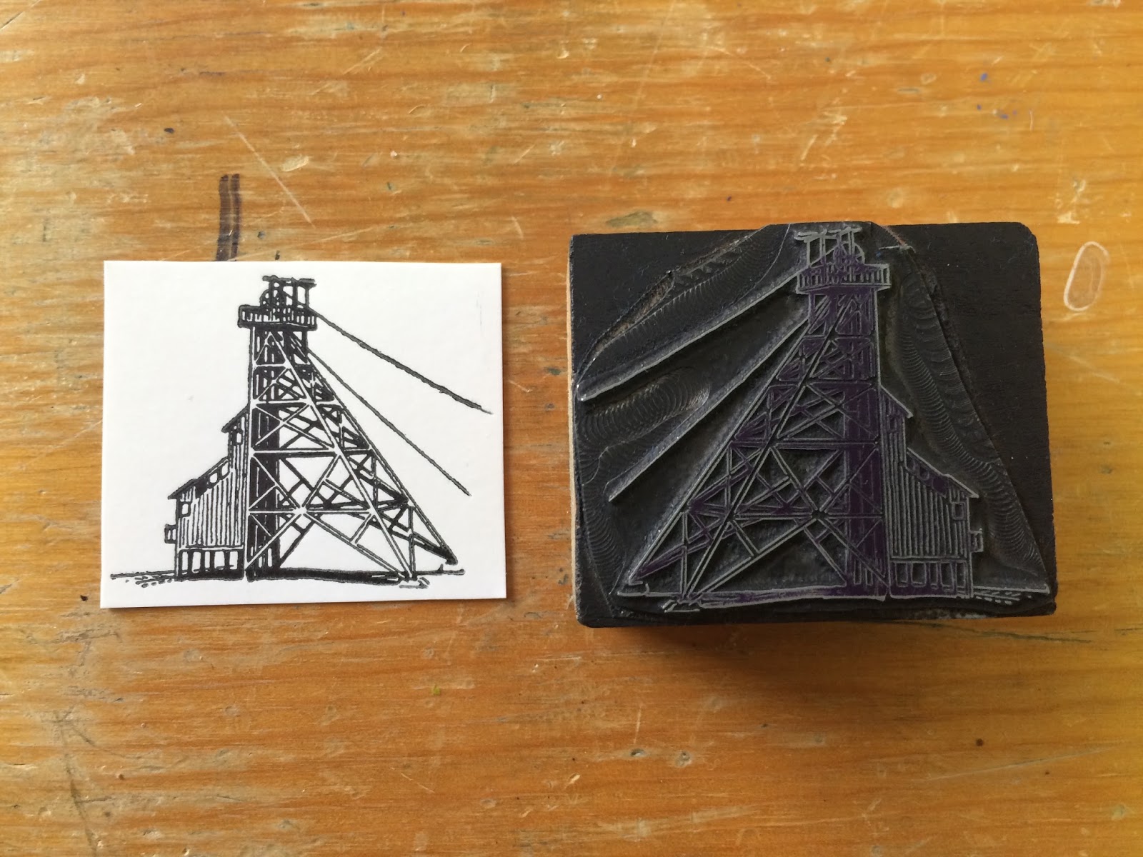
Here is my print for it, all made on the line-o-scribe at the IBRC. All the image pieces are from the WMM.
 |
| Final print "Superfund" |
 |
| Metallic copper ink is my jam right now |
 |
| Old image of the Berkeley Pit |
 |
| Butte! |
 |
| First sketch and design |
 |
| Second design, the final result was pretty close to this |
 |
| Hand stenciled the copper wave on the type for each print! |
My artist statement for "Superfund"
The Berkeley Pit is a former open pit copper mine which operated from 1955 until its closure on Earth Day in 1982. It is over a mile wide and is filled with water that is heavily acidic and laden with heavy metals and chemicals that threaten to pollute the surrounding groundwater. It is rare that the pit is ever out of eyesight when in Butte because it is so massive. I have been living next to this toxic body of water for years, albeit not as close to it as I am now. My outsiderness to Butte has not let me glance over this looming disaster; it threatens all westerners through an actual trickle down effect. In seven years, the threat of contamination could become a major turning point for communities in the surrounding area. My print functions as an in-your-face reminder that The Berkeley Pit is a problem that needs to be solved sooner rather than later.
-Christa